HELLO HILO

Digital Menu Design for a New Chain

Client
King's Hawaiian
Industry
Foodservice Retail
timeline
Aug - Dec 2022
team
3 Team Members
Role

User Research, Competitive Analysis, Client Relations, UX & UI


Overview

Our team was asked by King’s Hawaiian to create digital menu boards for Hello Hilo, an innovative fast-casual restaurant set to launch in Spring of 2023. This was a challenging yet satisfying project that required fast learning, adaptability, flexibility, and a lot of iterations.


Challenge

With limited space for displaying the extensive menu on four interior boards and two drive-thru boards, organizing items clearly and concisely was a major challenge. Day-parting added complexity by requiring different menu offerings at different times, necessitating a system for consistent transitions between breakfast, lunch, and dinner menus. The project also demanded flexibility to accommodate Kings Hawaiian's ongoing menu changes, requiring close and continuous collaboration. As this was my first project in the industry, I had to quickly become an expert in this area and explore innovative ways to engage customers, while staying true to Kings Hawaiian's brand identity and maintaining a consistent user experience across all touch-points.


Solution

I created wireframes and flexible layouts to accommodate evolving content, and utilized best practices and accessibility standards throughout the project. The final product incorporated clear hierarchy and navigation across 12 different menu boards, strategically placing content throughout the board for easy access and scannability. The project's complexity, uniqueness, and our team's ability to adapt and collaborate resulted in an exceptional end product that aligned with King's Hawaiian's brand identity and objectives.

01

Research and Learning

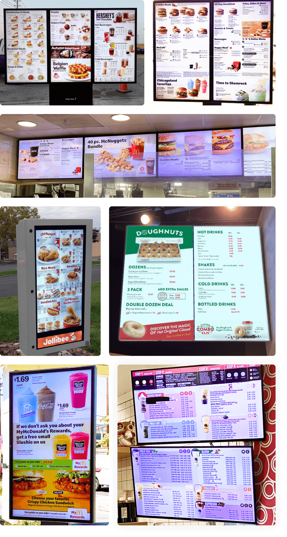
I began the design phase by conducting research of existing digital menu boards. I examined various examples, both online and in-person, to identify common trends, layouts, and designs. This in-depth analysis allowed me to gain valuable insights by evaluating what worked well and what to avoid. These insights were instrumental in shaping our approach to designing digital menu boards for Hello Hilo.

I began the design phase by conducting research of existing digital menu boards. I examined various examples, both online and in-person, to identify common trends, layouts, and designs. This in-depth analysis allowed me to gain valuable insights by evaluating what worked well and what to avoid. These insights were instrumental in shaping our approach to designing digital menu boards for Hello Hilo.

02

02

02

Best Practices and Accessibility

Best Practices and Accessibility

Best Practices and Accessibility

A key aspect that demanded early attention was understanding the best practices for digital menu board designs, with a special focus on accessibility. Considering that users are expected to read these boards from a specific distance, I prioritized factors such as proper color contrast, appropriate font sizes and weighting to ensure ease of legibility.


Ensuring scannability within the menu boards was also a main concern, as enabling users to quickly find what they were looking for played a crucial role in driving sales, enhancing user retention, and fostering repeated customer engagement.

03

03

03

Menu Categorization

Menu Categorization

Menu Categorization

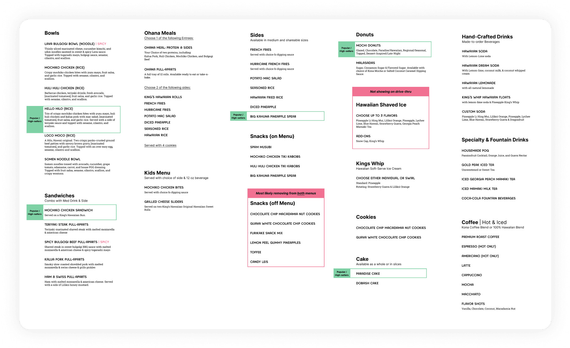
When diving into the actual design of the menu boards, the first challenge that I had to deal with was a lack of assets and limited information about the finalized menu. To address this, I developed a flexible layout that acted as a template to accommodate the final content once it was provided.


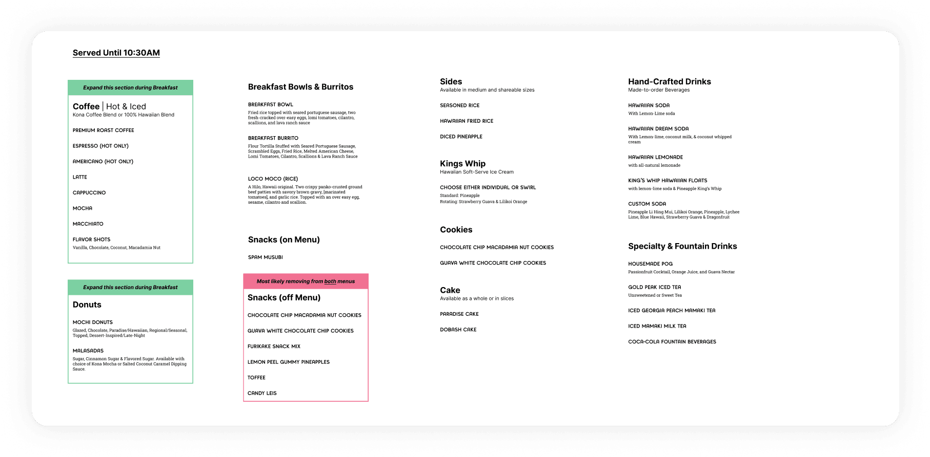
The first step involved categorizing the menu items into food categories, as well as breakfast, lunch, and dinner day parts. Once the categories were established and the menu items were properly organized, I identified potential items that required special attention, such as highlights or callouts.

04

04

04

Initial Wireframing

Initial Wireframing

Initial Wireframing

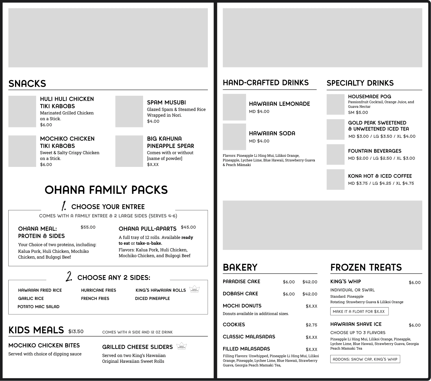
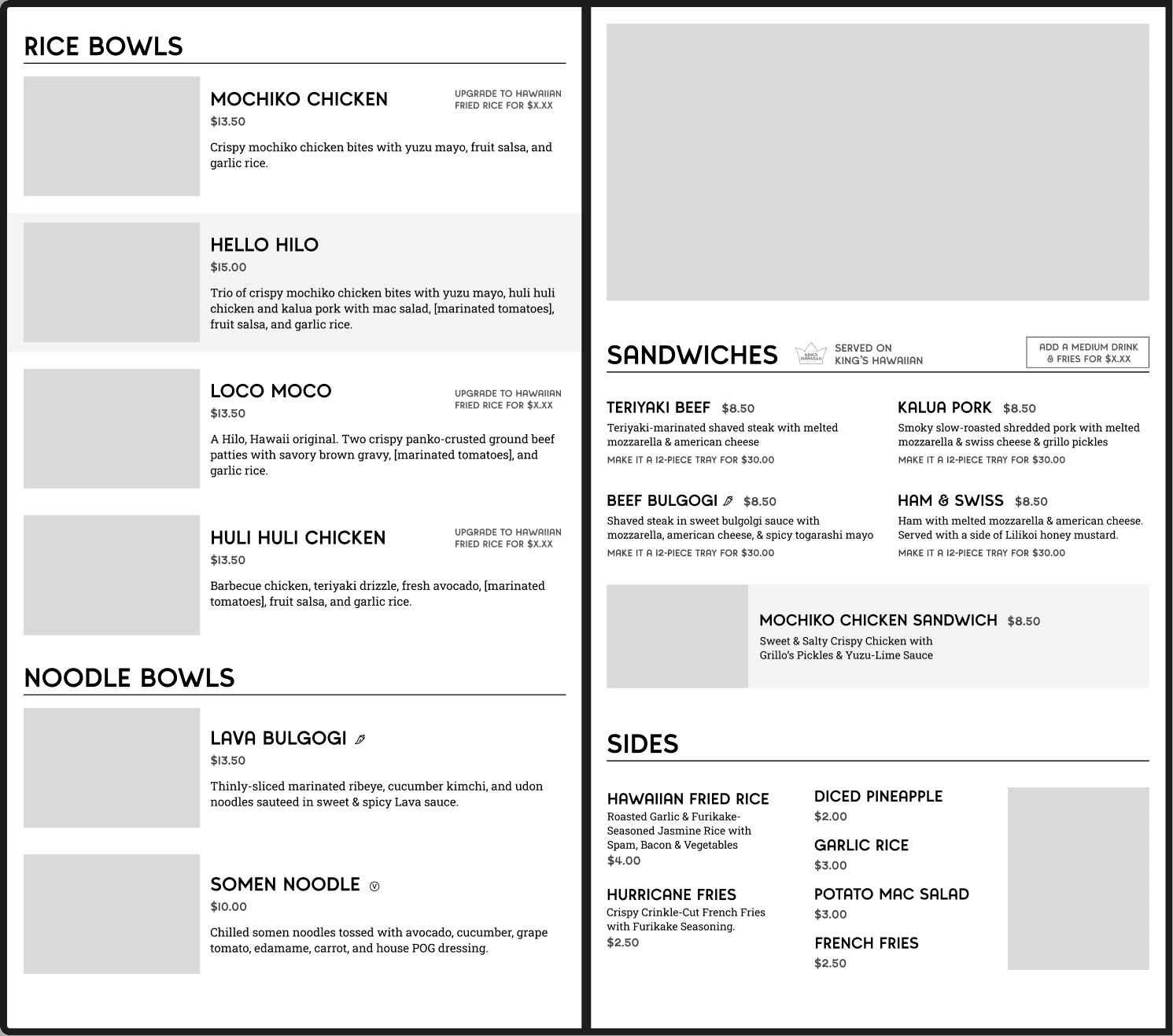
With the menu items properly categorized, I began creating a variety of wireframe layouts. Throughout this process, my main focus was to ensure that each page had a clear hierarchy, was easily scannable, and demonstrated a smooth progression when navigating across each board.

Due to the project being the first of its kind for our client and the menu content still evolving, I went through numerous rounds of iterations. Additionally, catering to day-parting, as well as interior and exterior menu designs, posed unique challenges, as each round of iterations necessitated changes to 12 different menu boards.

05

05

05

Final Wireframes

Final Wireframes

Final Wireframes

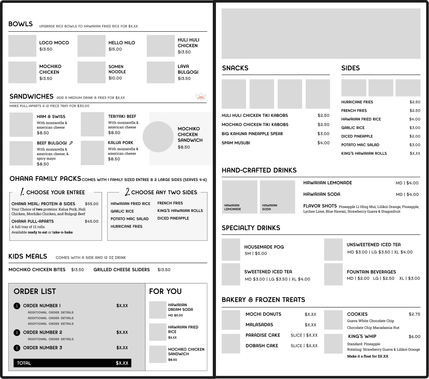
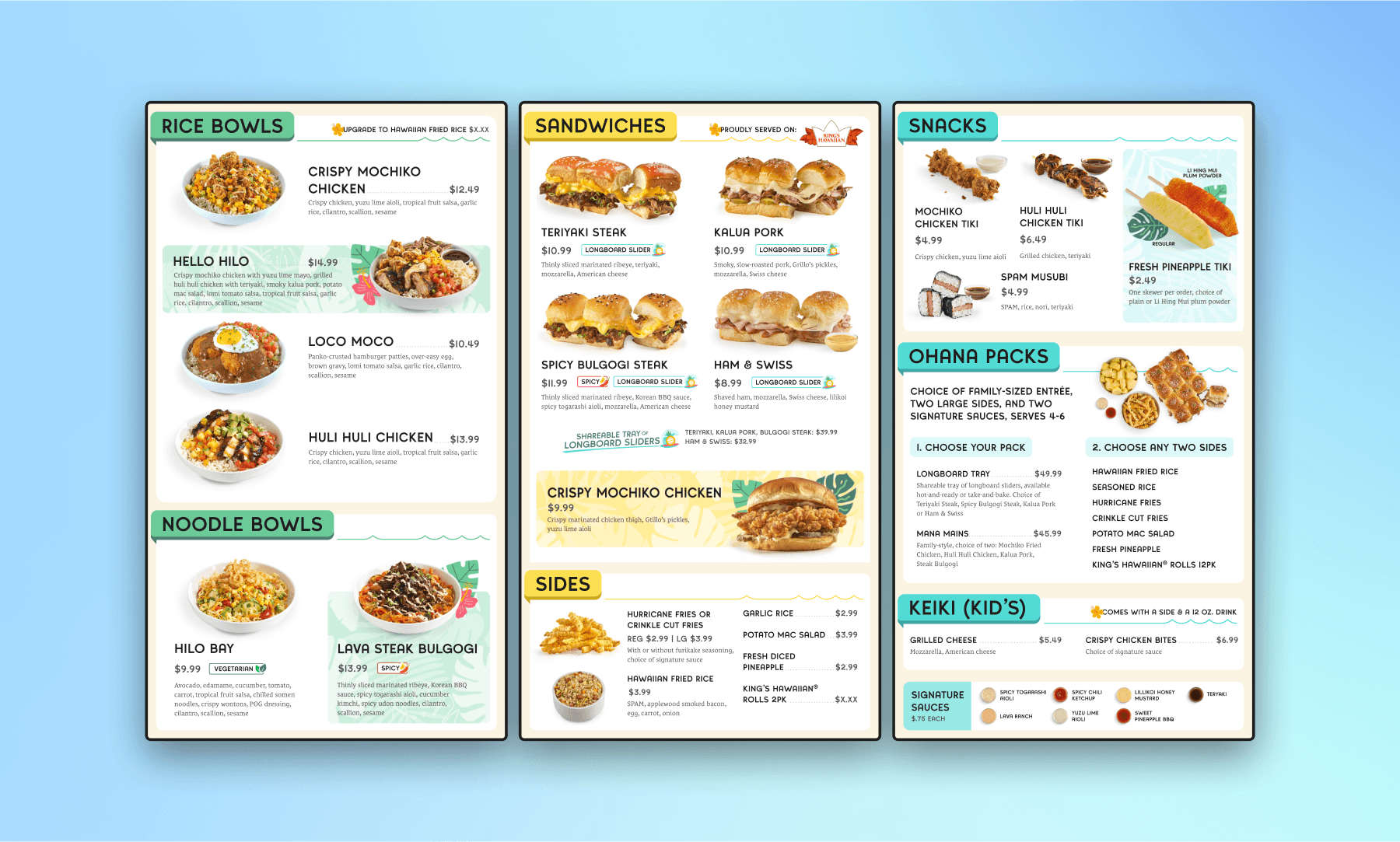
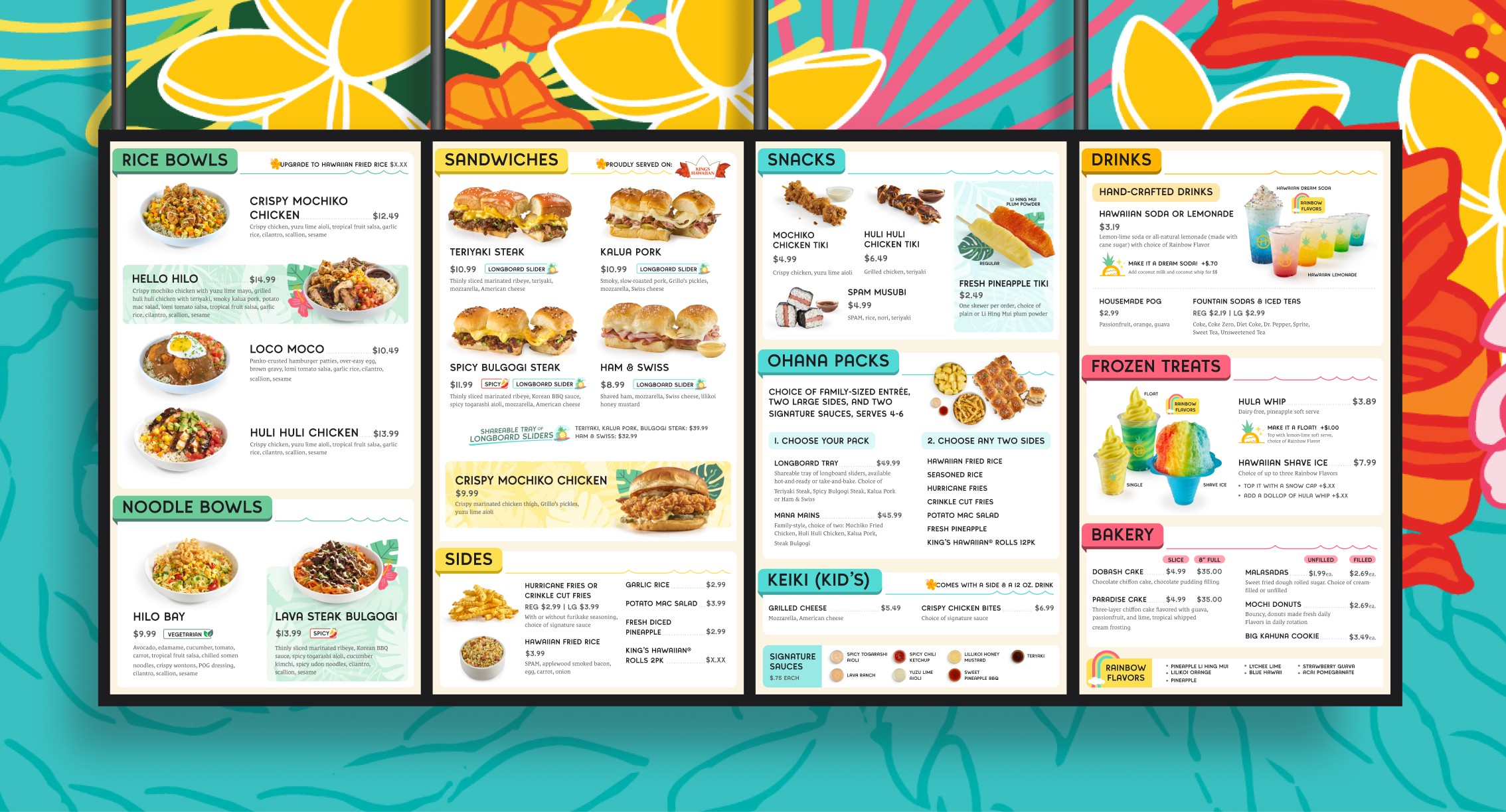
The culmination of these various rounds and iterations resulted in final designs that provided a consistent visual flow across each board and maintained a clear navigational hierarchy for users as they progressed through their order. For lunch and dinner, the boards were structured with the main entrees on the leftmost board, followed by sandwiches and sides on the second, progressing into snacks, family, and kids meals on the third, and wrapping up with drinks & desserts on the final board.


Keeping in mind that users began the ordering process as they entered from the left side of the restaurant, I strategically placed the primary items on the leftmost board to be easily accessible to them. I carried forward this approach for both breakfast and drive-thru menus, adapting as necessary based on the available real-estate.

Results

This project stood out to me as one of my favorites to date. It was complex, unique, and the final outcome turned out great. I had to do a lot of research and learn quickly to make important design decisions. The ability to offer recommendations to the clients as we progressed through the project was also greatly appreciated, especially as they were finalizing content on their end as well. I also wanted to give a big shoutout to the team and our visual designer who did an amazing job elevating the branding and adding enjoyable interactive moments to the boards.

This project stood out to me as one of my favorites to date. It was complex, unique, and the final outcome turned out great. I had to do a lot of research and learn quickly to make important design decisions. The ability to offer recommendations to the clients as we progressed through the project was also greatly appreciated, especially as they were finalizing content on their end as well. I also wanted to give a big shoutout to the team and our visual designer who did an amazing job elevating the branding and adding enjoyable interactive moments to the boards.

This project stood out to me as one of my favorites to date. It was complex, unique, and the final outcome turned out great. I had to do a lot of research and learn quickly to make important design decisions. The ability to offer recommendations to the clients as we progressed through the project was also greatly appreciated, especially as they were finalizing content on their end as well. I also wanted to give a big shoutout to the team and our visual designer who did an amazing job elevating the branding and adding enjoyable interactive moments to the boards.

MORE WORK